Color as Atmosphere: Evoking Mood through Aqueous Pigments
The gentle wheeze of an antique accordion, the scent of aged wood and leather... these are sensory echoes of a bygone era, a time when craftsmanship was revered and art wasn’t just about aesthetic beauty, but about the deep, emotional resonance it could evoke. It's a feeling that resonates deeply with the spirit of Mokuhanga, Japanese woodblock printing. Unlike many Western printmaking methods reliant on oily inks, Mokuhanga utilizes water-based pigments, a decision that fundamentally shapes the color palette and, crucially, the atmosphere achievable. The resulting prints aren's just pictures; they are whispers of feeling, carefully constructed through a deliberate relationship with color.
The Significance of Aqueous Color
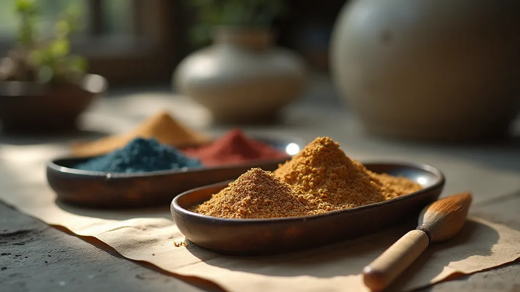
The choice of water-based pigments in Mokuhanga isn’t merely a technical preference; it's a reflection of a deeper philosophical approach to color. Western art, particularly during the Renaissance, often embraced vibrant, saturated colors to create a sense of grandeur and realism. However, Japanese aesthetics, heavily influenced by Zen Buddhism and the appreciation of nature, often prioritize subtlety, nuance, and a certain wabi-sabi – the beauty of imperfection. Water-based pigments lend themselves perfectly to this aesthetic. They tend to be softer, more translucent, and inherently less intense than their oil-based counterparts.
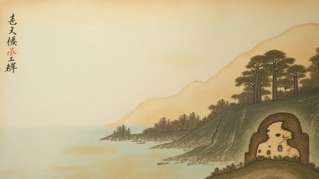
Consider the legacy of Ukiyo-e, a popular genre of Japanese woodblock prints that predates and influenced Mokuhanga. While Ukiyo-e prints sometimes employed brighter hues (often achieved through imported pigments), the mastery often lay in how artists utilized gradations and subtle shifts in color to create a sense of depth, atmosphere, and emotional impact. The translucent nature of the pigments allowed for layering and blending in a way that's difficult to replicate with oil-based inks. Each layer isn't simply adding color; it's subtly modifying the colors beneath, creating a complex and nuanced visual experience. This layering also necessitates incredible skill and an intimate understanding of how pigments interact with each other.
A Japanese Lens on Color Theory
While Western color theory, as defined by figures like Newton and Goethe, offers valuable insights into color relationships and perception, a Japanese approach to color often emphasizes harmony with nature and the psychological impact of color combinations. The five traditional colors – white, black, red, blue, and yellow – each carried symbolic weight and were often employed to evoke specific emotions. Red, for instance, often represents passion, energy, and even protection, while blue embodies tranquility and serenity.
Think about the use of indigo (ai) in many Mokuhanga prints. Its deep, calming blue isn't just a visual choice; it’s an invocation of the vastness of the sky, the tranquility of the ocean. The subtle variations in tone within the blue, achieved through careful layering and blending, further enhance this sense of serenity. Similarly, the use of madder red, derived from the madder root, evokes warmth, vitality, and a connection to the earth. These weren't arbitrary choices; they were carefully considered to contribute to the overall emotional impact of the print.
The Craftsmanship of Atmosphere
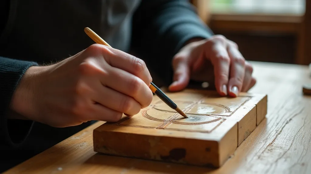
The process of creating Mokuhanga prints isn’t just about applying pigments to woodblocks. It’s a deeply meditative practice that demands patience, precision, and an almost intuitive understanding of the materials. The wood itself – typically cherry wood – is painstakingly carved by hand, requiring years of dedicated training to master the skill. The carving isn't just about creating lines; it’s about shaping the wood to capture the nuances of light and shadow. This inherent craftsmanship influences the final print’s appearance and texture.
The application of the pigments is equally critical. Traditionally, pigments are mixed with a thickener, often ground rice starch, to create a creamy consistency that adheres well to the woodblocks. These are then applied with delicate brushes, often requiring multiple passes to achieve the desired saturation and evenness. The process is inherently forgiving – mistakes can often be corrected by gently wiping away the pigment – but it also demands an almost obsessive attention to detail.
Beyond Technique: The Emotional Resonance
What truly distinguishes Mokuhanga isn’t just the technical aspects, but the emotional resonance it evokes. A print isn't judged solely on its accuracy of representation; it’s appreciated for its ability to convey a feeling, a mood, a sense of place. This is where the choice of water-based pigments truly shines. They allow for a softness, a subtlety, a kind of gentle melancholy that’s often absent in prints created with harsher, more saturated inks.
There’s a quiet dignity in a Mokuhanga print – a sense of humility and reverence for the natural world. It’s a reminder that beauty isn't always about bold pronouncements; it can be found in the quiet moments, in the subtle shifts in light and shadow, in the gentle harmony of colors. It’s an art form that speaks to the soul, inviting us to slow down, to appreciate the beauty that surrounds us, and to connect with a tradition that stretches back centuries.
Consider, too, the allure of antique Mokuhanga prints themselves. Beyond their aesthetic appeal, there's a tangible connection to the past – a sense of holding a piece of history in your hands. The subtle fading of the colors, the slight imperfections in the carving, the faint traces of the printer’s touch – these aren't flaws; they are evidence of a life lived, a story told. Collecting these prints can be an exercise in appreciating not just the art itself, but the craftsmanship, history, and cultural significance it represents. Restoring them requires a delicate touch, understanding the materials and the original intent of the artist – a process demanding profound respect for the past.