Chromatic Resonance: The Palette as Portal to Atmosphere in Mokuhanga
There's a particular scent associated with old tools, old paper, and the quiet dedication of a craftsman. It's the aroma of history, of hands that have shaped something beautiful from raw materials. I find it most acutely in antique accordions, instruments that breathe with the ghosts of melodies past, and in the studios of Mokuhanga artists. Both tell stories of careful processes, of restraint and profound emotional expression – and in Mokuhanga, that expression finds its primary voice through color.
Mokuhanga, or Japanese woodblock printing, isn’s simply about reproducing an image. It’s about capturing a feeling, a memory, a fleeting moment of atmospheric resonance. Unlike Western printmaking, which often emphasizes precise reproduction, Mokuhanga leans into the beauty of imperfection, the subtle variations born from the hand-carved blocks, the soft brushstrokes applying the water-based pigments, and the very nature of the paper itself. The color palette, seemingly limited at first glance, is actually a boundless landscape of possibility. It’s a testament to how far one can travel with just a few carefully chosen pigments.
The Foundation: Traditional Pigments and Their Echoes
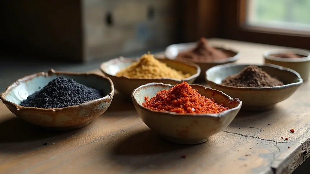
The pigments traditionally used in Mokuhanga are derived from natural sources. Indigo, extracted from the indigo plant, provides a range of blues, from a pale, ethereal sky blue to a deep, almost black indigo. Madder red, sourced from the madder root, offers a spectrum of reds and pinks, depending on the mordant used – the substance that helps the pigment bind to the paper. Ochre, a readily available earth pigment, contributes yellows and browns, grounding the palette with its warmth. These aren't just colors; they’ve accumulated layers of cultural meaning over centuries.
Consider indigo. In Japan, it’s historically associated with the working class – farmers and fishermen who wore indigo-dyed clothing. The deep blue also carries symbolic weight, representing the vastness of the ocean and the mystery of the night sky. Madder red, conversely, is often linked to vitality and passion, reflecting its presence in traditional ceremonies and celebrations. The subtle shifts in tone achievable with these pigments allow artists to evoke a range of emotions, from a quiet melancholy to a vibrant joy. The deliberate restraint in selecting and applying these pigments creates a silent conversation between the artist, the materials, and the viewer, a process akin to understanding the importance of the weight of grain in other forms of artistry – finding strength and vulnerability within limitations.
Beyond Depiction: Atmosphere and Emotional Depth
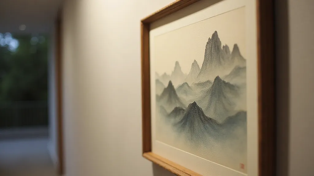
The beauty of Mokuhanga isn’s about slavishly reproducing a scene. It’s about capturing its essence, its emotional weight. A skilled Mokuhanga artist doesn’t simply paint a mountain; they evoke the feeling of its presence – its stillness, its majesty, its silent observation of the world. This is achieved through a careful manipulation of color – not just the choice of pigments, but also their application and layering.
The technique of “bokashi,” a gradual shading from one color to another, is particularly important in creating atmospheric perspective. By subtly blending indigo into the sky, an artist can create a sense of vastness and distance. Similarly, layering thin washes of madder red over a landscape can imbue it with a feeling of warmth and nostalgia. The beauty arises from the restraint - the conscious decision *not* to depict every detail, allowing the viewer's imagination to fill in the gaps. It's a practice of understanding the space created – the intentional voids that allow the work to breathe, a philosophy closely aligned with the principles of Ma's Embrace, cultivating space within the print to deepen its impact.
I remember visiting a small Mokuhanga studio nestled in the hills of Kyoto. The artist, a woman named Hana-san, was working on a print depicting a field of sunflowers. She wasn’t trying to replicate the sunflowers with photographic accuracy. Instead, she used soft washes of ochre and yellow, subtly blended with touches of green, to convey the feeling of sunlight warming the petals, the gentle rustling of the stalks in the breeze. The resulting print wasn’t just a picture of sunflowers; it was an experience – a fleeting moment of pastoral serenity. The act of allowing time to shape the work, to witness the gradual changes in pigment and paper, connects deeply with how artists document time and its effect, an observation detailed further in Wood as Witness: Documenting Time Through Mokuhanga.
The Dance of Layers: Bokashi, Washes, and Transparency
The transparency of the water-based pigments is key to the Mokuhanga aesthetic. Unlike oil-based paints, which tend to cover the underlying layers, water-based pigments allow for a sense of depth and luminosity. Each layer subtly influences the colors beneath, creating a complex and nuanced effect. The layering process itself is a meditative practice, a slow and deliberate dance between the artist and the block.
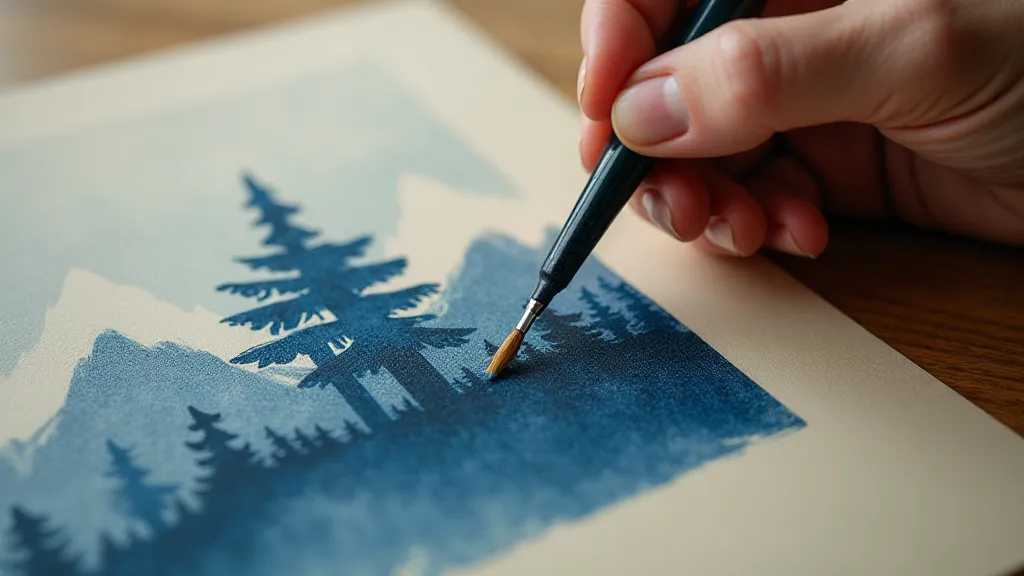
Consider how an artist might use multiple layers of indigo, each applied with a slightly different concentration and direction of brushstrokes, to create a sky that shifts from a pale, almost translucent blue to a deep, brooding indigo. Or how the careful layering of ochre and madder red can evoke the warmth and glow of a sunset. The possibilities are truly endless, limited only by the artist's imagination and their understanding of the materials. The collaborative nature of achieving such complexity is reflected in many Mokuhanga studios – a community effort where knowledge is shared and traditions are preserved, akin to the principles explored in The Silent Dialogue: Collaboration and Community in Mokuhanga.
Restoration and Appreciation: A Legacy of Beauty
Like antique accordions, vintage Mokuhanga prints often bear the marks of time – slight fading, the occasional crack in the paper, or the subtle discolorations that reveal their history. These imperfections aren’t flaws; they are evidence of a life lived, a testament to the enduring beauty of handmade art. Collectors and restorers appreciate the nuances of these aging prints, understanding that they represent a cultural heritage worth preserving.
The restoration of a Mokuhanga print is a delicate process, requiring a deep understanding of the materials and techniques. Harsh chemicals and aggressive cleaning methods can easily damage the paper and the pigments. Instead, the focus is on stabilization – gently repairing tears, consolidating loose areas, and preventing further deterioration. The goal isn’t to erase the past but to ensure that the print can be enjoyed for generations to come. This commitment to preserving history and tradition echoes throughout the Mokuhanga world, ensuring the art form thrives for generations to come.
Appreciating Mokuhanga isn’t just about admiring the finished product. It’s about understanding the painstaking process behind it – the carving of the blocks, the mixing of the pigments, the meticulous application of the washes. It’s about recognizing the skill and dedication of the artist, and the cultural significance of this unique form of Japanese art. It’s about allowing yourself to be transported by the subtle beauty of the colors, and the profound sense of atmosphere they evoke. Like the haunting melody of an old accordion, a Mokuhanga print speaks to the heart, reminding us of the enduring power of human creativity and the profound connection between art and the soul. The beauty lies not only in the finished piece but in the story of its creation, the deliberate choices made, and the respect for the materials used.